10: Layout and UI Design Customization
Chapter 10: Layout and UI Design Customization
Section titled “Chapter 10: Layout and UI Design Customization”Overview
Section titled “Overview”With authentication and authorization in place, it’s time to design a professional, user-friendly interface for your CRM. This chapter customizes the React starter kit’s layout, adds a navigation sidebar for CRM sections (Contacts, Companies, Deals, Tasks), and ensures responsive design for desktop and mobile.
You’ll use Tailwind CSS 4 for styling and shad cn/ui components for beautiful, accessible UI elements. The goal is to create a cohesive interface that makes the CRM intuitive to use. You’ll also learn to structure Inertia pages, create reusable React components, and implement consistent styling across all views.
By the end of this chapter, your CRM will have a polished interface with navigation, breadcrumbs, flash messages, and responsive layout. This UI foundation will support all the CRUD features you’ll build in upcoming chapters.
This chapter focuses on frontend design-HTML structure, CSS styling, and React components.
Project Structure Reference
Section titled “Project Structure Reference”Before you start, understand where your files will be organized:
resources/├── js/│   ├── Layouts/│   │   └── AuthenticatedLayout.tsx    ← Update this file│   ├── Components/│   │   ├── Sidebar.tsx                ← Create new│   │   ├── Header.tsx                 ← Create new│   │   ├── FlashMessage.tsx           ← Create new│   │   ├── Button.tsx                 ← Create new│   │   ├── Card.tsx                   ← Create new│   │   └── Alert.tsx                  ← Create new│   ├── Pages/│   │   └── Dashboard.tsx              ← Update this file│   └── types/│       └── index.ts                   ← Create new (or update)└── ts/    └── (TypeScript configuration)
app/├── Http/│   ├── Middleware/│   │   └── HandleInertiaRequests.php  ← Verify/update│   └── Kernel.php                     ← Verify middleware is registered
Important Note on Types:
Before starting, ensure your resources/ts/types/index.ts (or resources/js/types.ts) includes:
# filename: resources/ts/types/index.ts (or equivalent)export interface User {    id: number;    name: string;    email: string;    email_verified_at?: string;    created_at?: string;    updated_at?: string;}
export interface Team {    id: number;    name: string;    personal_team: boolean;    created_at?: string;    updated_at?: string;}
If these types don’t exist, Laravel/Inertia will provide them automatically, but TypeScript compilation might warn about unknown types. You can safely ignore these warnings or create the file above to remove them.
Prerequisites
Section titled “Prerequisites”Before starting this chapter, you should have:
- ✓ Completed Chapter 09 with team/role authorization
- ✓ React starter kit with Tailwind CSS 4 and shadcn/ui components working
- ✓ Inertia.js bridge between Laravel and React functioning
- ✓ Authentication system in place (Login, Register, Dashboard)
- ✓ Sail containers running with Node.js dev server active (
sail npm run dev) - ✓ Text editor open with project ready to modify
- ✓ Basic understanding of Tailwind utility classes (or willingness to learn)
- ✓ Familiarity with React components, props, and hooks
Accessibility & Dark Mode: Critical Design Principles
Section titled “Accessibility & Dark Mode: Critical Design Principles”Before building your UI, understand these two foundational principles:
Accessibility (A11y)
Section titled “Accessibility (A11y)”A modern CRM must be usable by everyone, including people with disabilities. This isn’t optional—it’s a legal requirement in many jurisdictions (WCAG 2.1 compliance).
Key Accessibility Principles:
-
Keyboard Navigation: All UI should work without a mouse
- ✅ Tab through all interactive elements
- ✅ Enter/Space to activate buttons
- ✅ Arrow keys for menus and lists
// Bad: Click-only button<div onClick={() => handleDelete()}>Delete</div>// Good: Keyboard accessible<button onClick={() => handleDelete()}>Delete</button> -
Color Contrast: Text must be readable for people with vision impairment
- ✅ Minimum 4.5:1 contrast ratio for normal text
- ✅ 3:1 for large text (18pt+)
// Bad: Light gray on white (poor contrast)<p className="text-gray-300">Your contacts</p>// Good: Dark gray on white<p className="text-gray-700">Your contacts</p> -
ARIA Labels: Screen readers need context
// Bad: Icon button with no label<button>🗑️</button>// Good: Accessible label<button aria-label="Delete contact">🗑️</button> -
Semantic HTML: Use proper HTML elements
// Bad: Div looks like button<div className="button" onClick={...}>Submit</div>// Good: Semantic button<button>Submit</button> -
Skip Navigation: Allow users to skip to main content
<a href="#main-content" className="sr-only">Skip to main content</a><nav>...</nav><main id="main-content">...</main>
Why It Matters for Your CRM:
- Users with vision impairment can’t use it otherwise
- Users with motor disabilities need keyboard navigation
- Legal compliance (ADA in US, EN 301 549 in EU)
- Better for everyone: seniors, people in noisy environments, etc.
Tailwind CSS Accessibility Helpers:
// sr-only: Hide visually but keep for screen readers<span className="sr-only">Loading...</span>
// focus ring: Visible focus indicator<button className="focus:ring-2 focus:ring-blue-500">Click me</button>
// Using built-in accessible componentsimport { Button } from "@/components/ui/button"<Button>Accessible by default</Button>
Dark Mode
Section titled “Dark Mode”Implement dark mode to reduce eye strain and support modern design expectations.
Implementation Pattern:
// In your layout componentexport default function Layout() {    const [isDark, setIsDark] = useState(false);
    useEffect(() => {        // Check user preference from localStorage or system        const savedTheme = localStorage.getItem('theme');        const prefersDark = window.matchMedia('(prefers-color-scheme: dark)').matches;
        if (savedTheme) {            setIsDark(savedTheme === 'dark');        } else {            setIsDark(prefersDark);        }    }, []);
    return (        <div className={isDark ? 'dark' : ''}>            <DarkModeToggle isDark={isDark} onChange={setIsDark} />            {/* Your content */}        </div>    );}
// Tailwind dark mode in CSS// resources/css/app.css@layer components {    .card {        @apply rounded-lg border border-gray-200 p-4;        @apply dark:border-gray-800 dark:bg-gray-900 dark:text-white;    }
    .button-primary {        @apply bg-blue-600 text-white;        @apply dark:bg-blue-700;    }}
Tailwind Dark Mode Utilities:
// Use dark: prefix for dark mode styles<div className="bg-white dark:bg-gray-900"> <h1 className="text-black dark:text-white">Title</h1> <p className="text-gray-700 dark:text-gray-300">Description</p></div>Responsive Design: Mobile-First Approach
Section titled “Responsive Design: Mobile-First Approach”Design for mobile first, then enhance for larger screens.
Breakpoints:
- sm: 640px (small phones)- md: 768px (tablets)- lg: 1024px (laptops)- xl: 1280px (desktops)- 2xl: 1536px (large desktops)Mobile-First Examples:
// Bad: Desktop-first (less flexible)<div className="w-full lg:w-1/2">
// Good: Mobile-first (stacks on mobile, side-by-side on desktop)<div className="w-full lg:w-1/2">
// Grid example<div className="grid grid-cols-1 md:grid-cols-2 lg:grid-cols-3 gap-4">    {/* 1 column on mobile, 2 on tablet, 3 on desktop */}</div>
// Sidebar example<div className="flex flex-col lg:flex-row">    <aside className="w-full lg:w-64">Sidebar</aside>    <main className="flex-1">Content</main></div>
Touch-Friendly Sizes:
- Buttons: Minimum 44x44px (not just 32px)
- Spacing: More padding on mobile
- Text: Larger font size on mobile
// Good: Touch-friendly<button className="px-4 py-3 sm:px-3 sm:py-2 text-base sm:text-sm"> Click me</button>Testing Responsive Design:
- Browser DevTools: F12 → Toggle device toolbar
- Test on actual devices (phone, tablet)
- Test portrait and landscape modes
- Test with zoom (up to 200%)
Estimated Time: ~90 minutes (includes all steps, exercises, and customization)
Verify your setup:
Before proceeding, ensure everything is running:
# Verify you're in the crm-app directorypwd  # Should end with: /path/to/crm-app
# Verify Sail containers are runningsail ps  # Should show: laravel.test, mysql, redis, mailhog all "Up"
# Verify Node dev server is running (in another terminal)# You should see: "VITE v... ready in XXXms"# If not running, start it: sail npm run dev
# Verify Laravel is accessiblecurl http://localhost  # Should return HTML
# Verify you can log in# Visit http://localhost/register → Create account# Visit http://localhost/login → Log in# Visit http://localhost/dashboard → Should see authenticated area
Quick Start
Section titled “Quick Start”Want to see the end result in 5 minutes? Here’s what you’ll have:
# After completing this chapter:
# 1. Visit the CRM - responsive layout with sidebar# http://localhost:8000
# 2. See your CRM's main sections in navigation# Dashboard | Contacts | Companies | Deals | Tasks
# 3. Team and user menu in header# ← Team Switcher User Profile ↑
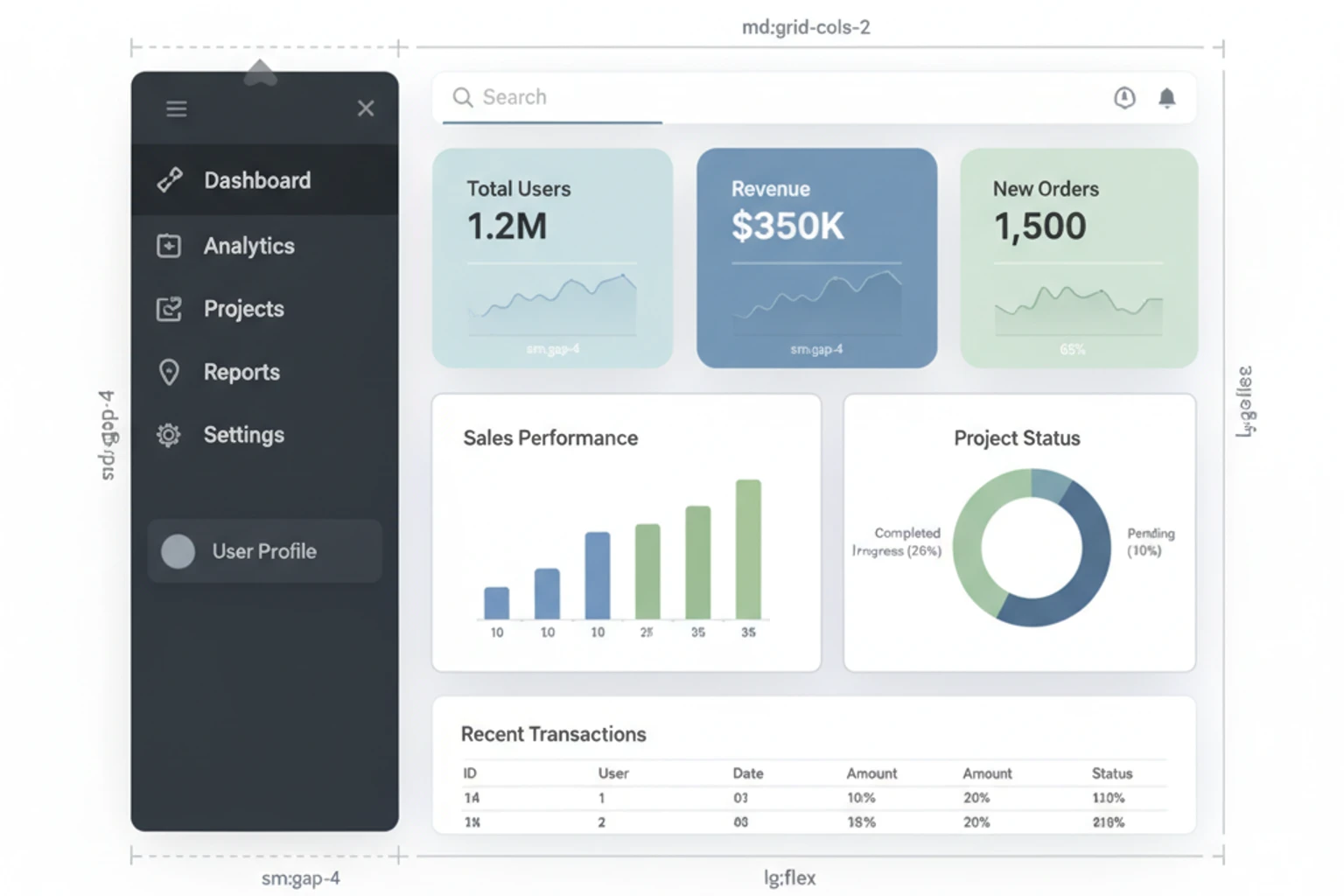
# 4. Clean, professional design throughout# Everything styled with Tailwind CSS 4# Reusable components for future chaptersYour CRM will look and feel production-ready—a solid foundation for all CRUD operations to come.
What You’ll Build
Section titled “What You’ll Build”By the end of this chapter, you will have:
- ✓ Custom application layout (
AppLayout.tsx) wrapping all pages - ✓ Sidebar navigation component with navigation links (Dashboard, Contacts, Companies, Deals, Tasks)
- ✓ Header with team switcher dropdown for multi-team support
- ✓ User menu with authenticated user info, profile settings, and logout
- ✓ Flash message component for success/error/info notifications
- ✓ Breadcrumb component for secondary navigation and page context
- ✓ Responsive design with mobile-friendly collapsible sidebar
- ✓ Consistent spacing, typography, and color scheme across all pages
- ✓ Reusable UI components (Button, Card, Alert) from shadcn/ui integrated
- ✓ Tailwind CSS configuration customized with CRM-specific colors and fonts
- ✓ Understanding of Inertia shared data for passing user/team data to all pages
- ✓ Dark mode support built into Tailwind configuration
Objectives
Section titled “Objectives”- Customize the React starter kit’s default layout
- Create a sidebar navigation component
- Add navigation links with active state highlighting
- Implement responsive mobile navigation
- Design a header with team switcher and user menu
- Create reusable UI components (Button, Card, Alert)
- Use shadcn/ui components for forms and modals
- Implement flash messages for user feedback
- Configure Tailwind theme colors and fonts
- Ensure accessibility (keyboard navigation, ARIA labels)
Step 1: Customize Application Layout (~20 min)
Section titled “Step 1: Customize Application Layout (~20 min)”Customize the default AuthenticatedLayout.tsx (created by Laravel Breeze) to include a professional sidebar, responsive header, and flash messages. This becomes the master layout wrapping all authenticated pages throughout your CRM.
Actions
Section titled “Actions”- Examine the Current Layout Structure:
Open the existing authenticated layout that Breeze created:
# Review what Breeze scaffolded for youcat resources/js/Layouts/AuthenticatedLayout.tsx
# This is a good starting point but needs customization for a CRM# It currently has basic structure but lacks:# - Sidebar navigation# - Team switching# - Professional styling- Understand the Layout Flow:
The layout is updated in multiple steps:
- Create individual components (Sidebar, Header, FlashMessage)
- Update AuthenticatedLayout to use these components
- Ensure the middleware shares data globally
This ensures every page automatically gets the new layout without needing changes to individual pages.
- Register Middleware for Inertia Shared Data:
Verify the middleware is registered in app/Http/Kernel.php:
protected $middlewareGroups = [ 'web' => [ // ... other middleware ... \App\Http\Middleware\HandleInertiaRequests::class, ],];If Laravel Breeze created this file automatically, it should already be there. Verify by searching:
grep -n "HandleInertiaRequests" app/Http/Kernel.php# Should output a line number if present- Update AuthenticatedLayout to Use New Layout Components (Critical Step):
The key is updating the default resources/js/Layouts/AuthenticatedLayout.tsx that Breeze created. Replace it with code that uses your new Sidebar and Header:
import React, { ReactNode, useState } from 'react';import { PropsWithChildren } from 'react';import Sidebar from '@/Components/Sidebar';import Header from '@/Components/Header';import FlashMessage from '@/Components/FlashMessage';import { User, Team } from '@/types';
interface AuthenticatedLayoutProps {    user: User;    team: Team;    header?: ReactNode;    children: ReactNode;}
export default function AuthenticatedLayout({    user,    team,    header,    children,}: PropsWithChildren<AuthenticatedLayoutProps>) {    const [showingNavigation, setShowingNavigation] = useState(false);
    return (        <div className="flex h-screen bg-gray-100 dark:bg-gray-900">            {/* Sidebar (Hidden on mobile unless toggled) */}            <Sidebar                user={user}                team={team}                isOpen={showingNavigation}                setIsOpen={setShowingNavigation}            />
            {/* Main Content Area */}            <div className="flex-1 flex flex-col overflow-hidden">                {/* Header with hamburger for mobile */}                <Header                    user={user}                    team={team}                    toggleSidebar={() => setShowingNavigation(!showingNavigation)}                />
                {/* Flash Messages */}                <FlashMessage />
{/* Page Content */} <main className="flex-1 overflow-auto bg-gray-100 dark:bg-gray-900 p-6"> {header && ( <header className="mb-6"> <h1 className="text-3xl font-bold text-gray-900 dark:text-white"> {header} </h1> </header> )} {children} </main> </div> </div> );}Important: All pages using Inertia layout property will now automatically use this layout:
// Any page (e.g., resources/js/Pages/Contacts/Index.tsx)export default function ContactsIndex() {    return (        // This automatically wraps with AuthenticatedLayout        <div>Your content here</div>    );}
// Register the layoutContactsIndex.layout = (page: React.ReactNode) => ( <AuthenticatedLayout children={page} />);- Update Dashboard to Use New Layout (Test it):
Update resources/js/Pages/Dashboard.tsx to use the new layout:
import { Head } from '@inertiajs/react';import AuthenticatedLayout from '@/Layouts/AuthenticatedLayout';import { User, Team } from '@/types';
interface DashboardProps {    user: User;    team: Team;}
export default function Dashboard({ user, team }: DashboardProps) {    return (        <AuthenticatedLayout user={user} team={team} header="Dashboard">            <Head title="Dashboard" />
            <div className="bg-white dark:bg-gray-800 shadow rounded-lg p-6">                <h2 className="text-2xl font-bold text-gray-900 dark:text-white mb-4">                    Welcome back, {user.name}!                </h2>                <p className="text-gray-600 dark:text-gray-400">                    You're viewing <strong>{team.name}</strong> team.                </p>            </div>        </AuthenticatedLayout>    );}
Expected Result
Section titled “Expected Result”After visiting http://localhost, you should see:
┌─────────────────────────────────────────────────┐│ CRM Logo Team: Acme Corp User ↓ │ ← Header├──────────┬─────────────────────────────────────┤│ │ ││Dashboard │ Dashboard ││Contacts │ ││Companies │ Welcome back, John! ││Deals │ You're viewing Acme Corp team. ││Tasks │ ││ │ ││Settings │ ││Logout │ │└──────────┴─────────────────────────────────────┘The layout should:
- Show a dark sidebar on the left with navigation items
- Display header at the top with team info and user menu
- Have main content area in the center
- Be fully responsive (sidebar collapses on mobile)
Why It Works
Section titled “Why It Works”Persistent Layout Pattern: Inertia allows you to define a layout once and apply it to multiple pages. When you navigate between pages using the same layout, Inertia only swaps the children content—the layout stays in place. This prevents unnecessary re-renders and creates a snappy SPA experience.
Benefits:
- Header and sidebar stay consistent across all pages
- User sees smooth page transitions (no layout flickering)
- Navigation state persists
- Animations and transitions feel native
Props Flow:
userandteamare passed from Laravel viaInertia::render()props- They’re available in all child pages automatically
- React components access them through component props
Troubleshooting
Section titled “Troubleshooting”-
Layout not appearing
- Verify
sail npm run devis running and watching file changes - Hard refresh browser:
Cmd+Shift+R(Mac) orCtrl+Shift+R(Windows) - Check browser console (F12) for React errors
- Verify
-
“Cannot find module ’@/Components/Sidebar’”
- Components don’t exist yet (we create them in Step 2)
- Add temporary imports for now, we’ll build them next
-
Dark mode not working
- Verify
tailwind.config.tshasdarkMode: 'class'configured - Add
dark:prefixed classes to see dark mode in action
- Verify
Step 2: Build Sidebar Navigation (~20 min)
Section titled “Step 2: Build Sidebar Navigation (~20 min)”Create a responsive sidebar component with CRM navigation links (Dashboard, Contacts, Companies, Deals, Tasks) that highlights the active route and collapses on mobile devices.
Actions
Section titled “Actions”- Create the Sidebar Component:
Create resources/js/Components/Sidebar.tsx:
import React, { Dispatch, SetStateAction } from 'react';import { Link, usePage } from '@inertiajs/react';import { User, Team } from '@/types';
interface Props {    user: User;    team: Team;    isOpen: boolean;    setIsOpen: Dispatch<SetStateAction<boolean>>;}
export default function Sidebar({ user, team, isOpen, setIsOpen }: Props) {    const { url } = usePage();
    const isActive = (route: string): boolean => {        return url.startsWith(route);    };
    const navItems = [        { name: 'Dashboard', href: '/dashboard', icon: '📊' },        { name: 'Contacts', href: '/contacts', icon: '👥' },        { name: 'Companies', href: '/companies', icon: '🏢' },        { name: 'Deals', href: '/deals', icon: '💼' },        { name: 'Tasks', href: '/tasks', icon: '✓' },    ];
    const baseClass = 'px-6 py-3 text-sm font-medium transition-colors';    const activeClass = 'bg-indigo-600 text-white border-r-4 border-indigo-700';    const inactiveClass = 'text-gray-600 hover:bg-gray-100 dark:text-gray-400 dark:hover:bg-gray-700';
    return (        <>            {/* Mobile Menu Button */}            <button                onClick={() => setIsOpen(!isOpen)}                className="md:hidden fixed top-4 left-4 z-50 p-2 bg-indigo-600 text-white rounded"            >                ☰            </button>
            {/* Mobile Overlay */}            {isOpen && (                <div                    className="md:hidden fixed inset-0 bg-black bg-opacity-50 z-40"                    onClick={() => setIsOpen(false)}                />            )}
            {/* Sidebar */}            <aside                className={`${                    isOpen ? 'translate-x-0' : '-translate-x-full'                } md:translate-x-0 fixed md:relative top-0 left-0 h-screen w-64 bg-white dark:bg-gray-800 shadow-lg transform transition-transform duration-200 ease-in-out z-40 flex flex-col`}            >                {/* Sidebar Header */}                <div className="p-6 border-b border-gray-200 dark:border-gray-700">                    <div className="flex items-center space-x-2">                        <div className="w-10 h-10 bg-indigo-600 rounded-lg flex items-center justify-center text-white font-bold">                            CRM                        </div>                        <div>                            <h2 className="font-bold text-gray-900 dark:text-white">CRM</h2>                            <p className="text-xs text-gray-500 dark:text-gray-400">Pro</p>                        </div>                    </div>                </div>
                {/* Navigation Links */}                <nav className="flex-1 px-3 py-6 space-y-2 overflow-y-auto">                    {navItems.map((item) => (                        <Link                            key={item.href}                            href={item.href}                            className={`${baseClass} ${                                isActive(item.href) ? activeClass : inactiveClass                            } flex items-center space-x-3 rounded-lg block`}                            onClick={() => setIsOpen(false)}                        >                            <span className="text-lg">{item.icon}</span>                            <span>{item.name}</span>                        </Link>                    ))}                </nav>
{/* Sidebar Footer */} <div className="p-6 border-t border-gray-200 dark:border-gray-700 space-y-2"> <Link href="/settings" className={`${baseClass} ${ isActive('/settings') ? activeClass : inactiveClass } flex items-center space-x-3 rounded-lg block`} > <span>⚙️</span> <span>Settings</span> </Link> <Link href="/logout" method="post" className={`${baseClass} text-red-600 hover:bg-red-50 dark:hover:bg-red-900/20 flex items-center space-x-3 rounded-lg block`} > <span>🚪</span> <span>Logout</span> </Link> </div> </aside> </> );}- Understand Active Route Detection:
The usePage() hook from Inertia gives you the current URL. Use it to highlight the active navigation item:
const { url } = usePage();
const isActive = (route: string): boolean => {    return url.startsWith(route);};
// Now in JSX:<Link href="/contacts" className={isActive('/contacts') ? 'active' : ''}>    Contacts</Link>
Expected Result
Section titled “Expected Result”After visiting the CRM, your sidebar should:
┌────────────────────┐│ CRM │ ← Logo/Branding│ Pro │├────────────────────┤│ ││ 📊 Dashboard │ ← Current active (highlighted)│ 👥 Contacts ││ 🏢 Companies ││ 💼 Deals ││ ✓ Tasks ││ │├────────────────────┤│ ⚙️ Settings ││ 🚪 Logout │└────────────────────┘On mobile (screen < 768px):
- Sidebar is hidden by default
- Hamburger menu (☰) appears in top-left
- Click menu to toggle sidebar visibility
- Click a link to auto-close sidebar
Why It Works
Section titled “Why It Works”Active Route Highlighting: Using usePage().url allows you to detect the current route and apply active styling. This gives users clear visual feedback about where they are in the application.
Responsive Sidebar:
- Desktop (md+): Sidebar always visible, takes fixed width
- Mobile: Sidebar hidden by default, toggles with button
- Uses Tailwind’s
md:breakpoint to change behavior at 768px
Smooth Transitions: The transform transition-transform duration-200 classes create a smooth slide-in/slide-out animation on mobile.
Accessibility Enhancements for Sidebar
Section titled “Accessibility Enhancements for Sidebar”The sidebar component should be fully accessible. Here’s what to add:
// Add these improvements to resources/js/Components/Sidebar.tsx
// 1. Add proper ARIA attributes to the sidebar<aside    className={...}    aria-label="Main navigation"    role="navigation">
// 2. Add aria-current to active link<Link    key={item.href}    href={item.href}    aria-current={isActive(item.href) ? 'page' : undefined}    className={...}>    {item.name}</Link>
// 3. Add keyboard support for closinguseEffect(() => {    const handleEscape = (e: KeyboardEvent) => {        if (e.key === 'Escape' && isOpen) {            setIsOpen(false);        }    };
    document.addEventListener('keydown', handleEscape);    return () => document.removeEventListener('keydown', handleEscape);}, [isOpen]);
Troubleshooting
Section titled “Troubleshooting”-
Sidebar always shows/hides incorrectly
- Check
useStateis imported from React - Verify click handlers are attached to buttons
- Check
-
Active highlighting not working
- Verify
usePage()is imported from ‘@inertiajs/react’ - Check that route names match your navigation hrefs exactly
- Add console.log(url) to debug current URL
- Verify
-
Mobile menu doesn’t close automatically
- Ensure
onClick={() => setIsOpen(false)}is on Link components - Verify overlay click handler also closes menu
- Ensure
-
Keyboard navigation not working
- Verify useEffect for Escape key is added
- Check browser console for JavaScript errors
Step 3: Create Header with Team Switcher (~15 min)
Section titled “Step 3: Create Header with Team Switcher (~15 min)”Build a header component with a team switcher dropdown (for multi-team accounts) and a user menu (profile, logout) in the top-right corner.
Actions
Section titled “Actions”- Create the Header Component:
Create resources/js/Components/Header.tsx:
import React, { useState } from 'react';import { Link, usePage } from '@inertiajs/react';import { User, Team } from '@/types';
interface Props {    user: User;    team: Team;    toggleSidebar?: () => void;}
export default function Header({ user, team, toggleSidebar }: Props) {    const [teamOpen, setTeamOpen] = useState(false);    const [userOpen, setUserOpen] = useState(false);    const { props } = usePage();    const teams = (props.teams as Team[]) || [team];
    return (        <header className="bg-white dark:bg-gray-800 shadow-sm border-b border-gray-200 dark:border-gray-700">            <div className="px-4 sm:px-6 md:px-8 py-4">                <div className="flex items-center justify-between">                    {/* Left: Mobile Menu Button */}                    <button                        onClick={toggleSidebar}                        className="md:hidden p-2 text-gray-600 dark:text-gray-400 hover:bg-gray-100 dark:hover:bg-gray-700 rounded"                        aria-label="Toggle navigation"                    >                        <svg className="w-6 h-6" fill="none" stroke="currentColor" viewBox="0 0 24 24">                            <path strokeLinecap="round" strokeLinejoin="round" strokeWidth={2} d="M4 6h16M4 12h16M4 18h16" />                        </svg>                    </button>
                    {/* Center: Team info (optional, hidden on mobile) */}                    <div className="hidden sm:flex items-center space-x-4">                        <span className="text-gray-600 dark:text-gray-400">Team:</span>                        <span className="font-semibold text-gray-900 dark:text-white">                            {team.name}                        </span>                    </div>
                    {/* Right: Team Switcher and User Menu */}                    <div className="flex items-center justify-end space-x-6">                        {/* Team Switcher Dropdown */}                        <div className="relative">                            <button                                onClick={() => setTeamOpen(!teamOpen)}                                className="flex items-center space-x-2 px-3 py-2 rounded-lg bg-gray-100 dark:bg-gray-700 hover:bg-gray-200 dark:hover:bg-gray-600 transition-colors"                            >                                <span className="text-sm font-medium text-gray-700 dark:text-gray-300">                                    {team.name}                                </span>                                <span className="text-xs">▼</span>                            </button>
                            {/* Team Dropdown Menu */}                            {teamOpen && teams.length > 1 && (                                <div className="absolute right-0 mt-2 w-48 bg-white dark:bg-gray-800 rounded-lg shadow-xl border border-gray-200 dark:border-gray-700 z-50">                                    {teams.map((t) => (                                        <Link                                            key={t.id}                                            href={`/teams/${t.id}`}                                            className={`block px-4 py-2 text-sm ${                                                t.id === team.id                                                    ? 'bg-indigo-50 dark:bg-indigo-900/20 text-indigo-700 dark:text-indigo-400 font-medium'                                                    : 'text-gray-700 dark:text-gray-300 hover:bg-gray-100 dark:hover:bg-gray-700'                                            }`}                                            onClick={() => setTeamOpen(false)}                                        >                                            {t.name}                                        </Link>                                    ))}                                </div>                            )}                        </div>
                        {/* User Menu Dropdown */}                        <div className="relative">                            <button                                onClick={() => setUserOpen(!userOpen)}                                className="flex items-center space-x-2 px-3 py-2 rounded-lg bg-gray-100 dark:bg-gray-700 hover:bg-gray-200 dark:hover:bg-gray-600 transition-colors"                            >                                <div className="w-8 h-8 bg-indigo-600 rounded-full flex items-center justify-center text-white text-xs font-bold">                                    {user.name.split(' ')[0][0]}                                </div>                                <span className="hidden sm:inline text-sm font-medium text-gray-700 dark:text-gray-300">                                    {user.name.split(' ')[0]}                                </span>                                <span className="text-xs">▼</span>                            </button>
{/* User Dropdown Menu */} {userOpen && ( <div className="absolute right-0 mt-2 w-48 bg-white dark:bg-gray-800 rounded-lg shadow-xl border border-gray-200 dark:border-gray-700 z-50"> <div className="px-4 py-3 border-b border-gray-200 dark:border-gray-700"> <p className="text-sm font-medium text-gray-900 dark:text-white"> {user.name} </p> <p className="text-xs text-gray-500 dark:text-gray-400"> {user.email} </p> </div> <Link href="/profile" className="block px-4 py-2 text-sm text-gray-700 dark:text-gray-300 hover:bg-gray-100 dark:hover:bg-gray-700" onClick={() => setUserOpen(false)} > Profile Settings </Link> <Link href="/settings" className="block px-4 py-2 text-sm text-gray-700 dark:text-gray-300 hover:bg-gray-100 dark:hover:bg-gray-700 border-b border-gray-200 dark:border-gray-700" onClick={() => setUserOpen(false)} > Account Settings </Link> <Link href="/logout" method="post" className="block px-4 py-2 text-sm text-red-600 hover:bg-red-50 dark:hover:bg-red-900/20 rounded-b-lg" onClick={() => setUserOpen(false)} > Logout </Link> </div> )} </div> </div> </div> </div> </header> );}- Share Team Data with All Pages (Backend):
Backend integration is critical—the frontend components need team data available on every page. Add this to your app/Http/Middleware/HandleInertiaRequests.php (or create one if it doesn’t exist):
<?php
declare(strict_types=1);
namespace App\Http\Middleware;
use Illuminate\Http\Request;use Inertia\Middleware;
class HandleInertiaRequests extends Middleware{    public function share(Request $request): array    {        $user = $request->user();
        return array_merge(parent::share($request), [            'user' => $user,            'team' => $user ? $user->currentTeam : null,            'teams' => $user ? $user->teams : [],           // All user's teams            'flash' => [                'success' => session('success'),                'error' => session('error'),                'warning' => session('warning'),                'info' => session('info'),            ],        ]);    }}
This middleware:
- Shares
user,team, andteamsdata on every Inertia page - Makes flash messages available globally
- Runs automatically on authenticated routes (via
webmiddleware group) - Eliminates need to pass team/user data from individual controllers
Expected Result
Section titled “Expected Result”Your header should display:
┌────────────────────────────────────────────┐│ Team: Acme Corp │ John ▼ │└────────────────────────────────────────────┘When you click on the team dropdown:
Acme Corp ✓ (currently selected)Startup XYZPersonalWhen you click on your name:
John Smithjohn@example.com─────────────────Profile SettingsAccount Settings─────────────────LogoutWhy It Works
Section titled “Why It Works”Dropdown State Management: Using useState to toggle dropdowns provides immediate visual feedback. Clicking outside (or on other dropdowns) can close previous menus.
Shared Props: By adding userTeams to Inertia shared data in the middleware, every page receives this data automatically. No need to pass it through every controller.
Icon Avatars: Using the user’s initials in a colored circle is a common pattern that’s both accessible and visually appealing.
Troubleshooting
Section titled “Troubleshooting”-
Team switcher dropdown not showing
- Verify
userTeamsprop is being passed from the controller - Check that user has multiple teams assigned in the database
- Verify
-
Click outside doesn’t close menu
- You can enhance this by adding a useEffect with global click listener (optional for now)
-
Dropdown appears behind other content
- Verify
z-50class is applied to dropdown div
- Verify
Step 4: Implement Flash Messages (~15 min)
Section titled “Step 4: Implement Flash Messages (~15 min)”Create a flash message component that displays success, error, and info notifications from Laravel to provide user feedback on actions.
Actions
Section titled “Actions”- Create FlashMessage Component:
Create resources/js/Components/FlashMessage.tsx:
import React, { useState, useEffect } from 'react';import { usePage } from '@inertiajs/react';
type FlashType = 'success' | 'error' | 'info' | 'warning';
interface Flash {    type: FlashType;    message: string;}
export default function FlashMessage() {    const { props } = usePage();    const flash = props.flash as Record<string, string> || {};    const [visible, setVisible] = useState(true);
    // Auto-dismiss after 5 seconds    useEffect(() => {        if (Object.keys(flash).length > 0) {            setVisible(true);            const timer = setTimeout(() => setVisible(false), 5000);            return () => clearTimeout(timer);        }    }, [flash]);
    if (!visible || Object.keys(flash).length === 0) return null;
    // Determine the type and style    const getFlashData = (): Flash => {        if (flash.success) return { type: 'success', message: flash.success };        if (flash.error) return { type: 'error', message: flash.error };        if (flash.warning) return { type: 'warning', message: flash.warning };        return { type: 'info', message: flash.info || 'Information' };    };
    const { type, message } = getFlashData();
    const bgColor = {        success: 'bg-green-50 dark:bg-green-900/20',        error: 'bg-red-50 dark:bg-red-900/20',        warning: 'bg-yellow-50 dark:bg-yellow-900/20',        info: 'bg-blue-50 dark:bg-blue-900/20',    }[type];
    const textColor = {        success: 'text-green-800 dark:text-green-200',        error: 'text-red-800 dark:text-red-200',        warning: 'text-yellow-800 dark:text-yellow-200',        info: 'text-blue-800 dark:text-blue-200',    }[type];
    const borderColor = {        success: 'border-green-200 dark:border-green-800',        error: 'border-red-200 dark:border-red-800',        warning: 'border-yellow-200 dark:border-yellow-800',        info: 'border-blue-200 dark:border-blue-800',    }[type];
    const icon = {        success: '✓',        error: '✕',        warning: '!',        info: 'ℹ',    }[type];
return ( <div className={`${bgColor} border-l-4 ${borderColor} p-4 m-4 rounded`}> <div className="flex items-center space-x-3"> <span className={`text-xl font-bold ${textColor}`}>{icon}</span> <p className={`text-sm font-medium ${textColor}`}>{message}</p> <button onClick={() => setVisible(false)} className="ml-auto text-gray-400 hover:text-gray-600" > ✕ </button> </div> </div> );}- Send Flash Messages from Controllers:
Example in any controller action:
// After creating a contactreturn redirect('/contacts')->with('success', 'Contact created successfully!');
// After an errorreturn redirect()->back()->with('error', 'Failed to update contact');
// Info messagereturn redirect('/dashboard')->with('info', 'Welcome back!');
Expected Result
Section titled “Expected Result”When you create or update something, you’ll see a notification:
┌─────────────────────────────────────────────┐│ ✓ Contact created successfully! ✕ │└─────────────────────────────────────────────┘Different types:
- Success (green): ✓ action completed
- Error (red): ✕ something went wrong
- Warning (yellow): ! be careful
- Info (blue): ℹ just letting you know
Messages auto-dismiss after 5 seconds or when user clicks the X button.
Why It Works
Section titled “Why It Works”Flash Data: Laravel stores data in the session to show on the next page load. Inertia automatically includes flash data in props, so React components can access it.
Auto-dismiss: Using useEffect with a timeout creates a good UX - users see the message but aren’t bothered by it lingering.
Tailwind Styling: Color-coding messages helps users quickly identify success vs. errors.
Troubleshooting
Section titled “Troubleshooting”- Flash messages not appearing
- Verify controller is calling
with('type', 'message') - Check
HandleInertiaRequestsmiddleware sharesflashdata - Verify FlashMessage component is rendered in AppLayout
- Verify controller is calling
Step 5: Create Reusable UI Components (~20 min)
Section titled “Step 5: Create Reusable UI Components (~20 min)”Build reusable React components (Button, Card, Alert) that maintain consistent styling across all pages and follow Tailwind CSS best practices.
Actions
Section titled “Actions”- Create Button Component:
Create resources/js/Components/Button.tsx:
import React, { ReactNode } from 'react';
type ButtonVariant = 'primary' | 'secondary' | 'danger' | 'ghost';type ButtonSize = 'sm' | 'md' | 'lg';
interface ButtonProps extends React.ButtonHTMLAttributes<HTMLButtonElement> {    variant?: ButtonVariant;    size?: ButtonSize;    loading?: boolean;    children: ReactNode;}
export default function Button({    variant = 'primary',    size = 'md',    loading = false,    disabled,    children,    className = '',    ...props}: ButtonProps) {    const baseClass = 'font-medium rounded-lg transition-colors disabled:opacity-50 disabled:cursor-not-allowed';
    const variants = {        primary: 'bg-indigo-600 text-white hover:bg-indigo-700',        secondary: 'bg-gray-200 text-gray-900 hover:bg-gray-300 dark:bg-gray-700 dark:text-white dark:hover:bg-gray-600',        danger: 'bg-red-600 text-white hover:bg-red-700',        ghost: 'text-gray-700 hover:bg-gray-100 dark:text-gray-300 dark:hover:bg-gray-700',    };
    const sizes = {        sm: 'px-3 py-1 text-sm',        md: 'px-4 py-2 text-base',        lg: 'px-6 py-3 text-lg',    };
return ( <button {...props} disabled={disabled || loading} className={`${baseClass} ${variants[variant]} ${sizes[size]} ${className}`} > {loading ? '⏳ Loading...' : children} </button> );}- Create Card Component:
Create resources/js/Components/Card.tsx:
import React, { ReactNode } from 'react';
interface CardProps {    children: ReactNode;    className?: string;}
export default function Card({ children, className = '' }: CardProps) { return ( <div className={`bg-white dark:bg-gray-800 shadow rounded-lg p-6 ${className}`}> {children} </div> );}- Create Alert Component:
Create resources/js/Components/Alert.tsx:
import React, { ReactNode } from 'react';
type AlertType = 'success' | 'error' | 'warning' | 'info';
interface AlertProps {    type?: AlertType;    title?: string;    children: ReactNode;}
export default function Alert({ type = 'info', title, children }: AlertProps) {    const bgColor = {        success: 'bg-green-50 dark:bg-green-900/10 border-green-200 dark:border-green-800',        error: 'bg-red-50 dark:bg-red-900/10 border-red-200 dark:border-red-800',        warning: 'bg-yellow-50 dark:bg-yellow-900/10 border-yellow-200 dark:border-yellow-800',        info: 'bg-blue-50 dark:bg-blue-900/10 border-blue-200 dark:border-blue-800',    }[type];
    const textColor = {        success: 'text-green-800 dark:text-green-200',        error: 'text-red-800 dark:text-red-200',        warning: 'text-yellow-800 dark:text-yellow-200',        info: 'text-blue-800 dark:text-blue-200',    }[type];
    return (        <div className={`border-l-4 rounded p-4 ${bgColor}`}>            {title && <p className={`font-bold mb-2 ${textColor}`}>{title}</p>}            <p className={`text-sm ${textColor}`}>{children}</p>        </div>    );}
Expected Result
Section titled “Expected Result”You now have reusable components you can use throughout your CRM:
// Button component<Button variant="primary" size="md">Create Contact</Button><Button variant="danger" loading={isLoading}>Deleting...</Button>
// Card component<Card>    <h2 className="text-lg font-bold">Recent Contacts</h2>    <p>Content goes here...</p></Card>
// Alert component<Alert type="success" title="Success!">    Your contact has been created.</Alert>
Why It Works
Section titled “Why It Works”Component Reusability: Instead of repeating the same Tailwind classes everywhere, centralize them in components. This makes styling consistent and changes easy.
Variant Pattern: The variant prop allows one component to have multiple styles, reducing code duplication.
TypeScript Props: Type-safe prop interfaces prevent bugs and make components self-documenting.
Troubleshooting
Section titled “Troubleshooting”-
Components not found
- Verify all components are in
resources/js/Components/ - Check capitalization matches import statements
- Verify all components are in
-
Styling looks off
- Ensure Tailwind CSS 4 is installed:
npm list tailwindcss - Verify
tailwind.config.tsincludes all component paths
- Ensure Tailwind CSS 4 is installed:
Testing & Debugging Your UI Components
Section titled “Testing & Debugging Your UI Components”After completing all 5 steps, you should verify everything is working correctly. This section shows you how.
Verify Tailwind CSS is Compiling
Section titled “Verify Tailwind CSS is Compiling”Before testing components, confirm Tailwind is working:
# Check if Tailwind is watching for changessail npm run dev
# You should see output like:# ✓ 123 modules transformed# Network: use --host to expose
# In a new terminal, check if CSS is being compiledls -la public/build/assets/
# You should see:# app-XXXXX.js# app-XXXXX.css# manifest.json
If Tailwind CSS isn’t working:
- Verify
tailwind.config.tsincludes component paths:content: ['./resources/**/*.tsx', // Includes all .tsx files] - Restart dev server:
sail npm run dev - Hard refresh browser:
Cmd+Shift+R(Mac) orCtrl+Shift+R(Windows)
Test Components with Browser DevTools
Section titled “Test Components with Browser DevTools”-
Open Developer Tools:
- Press
F12(Windows/Linux) orCmd+Option+I(Mac) - Switch to “Console” tab
- Press
-
Check for JavaScript Errors:
- Look for red error messages
- Common React errors:
❌ "Cannot find module '@/Components/Sidebar'"→ Check import paths are correct❌ "Cannot read property 'map' of undefined"→ teams or users prop might be undefined❌ "Tailwind class not applied"→ Tailwind might not be compiling
-
Inspect Component Styling:
- Right-click on an element → “Inspect”
- Check “Styles” tab to see applied CSS
- Verify Tailwind classes are applied:
✓ Should show: "flex", "h-screen", "bg-gray-100", etc.❌ Should NOT show: Generic styles without class names
-
Test Mobile Responsiveness:
- Press
Ctrl+Shift+M(Windows) orCmd+Shift+M(Mac) - Toggle device toolbar in DevTools
- Test these viewports:
- Mobile: 375px width
- Tablet: 768px width
- Desktop: 1024px width
- Press
Verify Component Props
Section titled “Verify Component Props”Check that components are receiving the correct data:
// Add this temporarily to verify propsconsole.log('Sidebar props:', { user, team, isOpen });console.log('Header props:', { user, team });console.log('Flash messages:', flash);Expected output in console:
Sidebar props: {    user: { id: 1, name: "John", email: "john@example.com" },    team: { id: 1, name: "Acme Corp" },    isOpen: false}
Header props: {    user: { id: 1, name: "John", ... },    team: { id: 1, name: "Acme Corp" }}
Flash messages: {    success: null,    error: null}
Common Issues and Solutions
Section titled “Common Issues and Solutions”Sidebar not showing
- DevTools → Check console for errors
- Verify
HandleInertiaRequestsmiddleware is sharing data - Check
isOpenstate in Header component - Verify CSS classes are applied (inspect element)
Mobile hamburger doesn’t work
- Verify
toggleSidebarfunction is passed to Header - Check that button has
onClick={toggleSidebar} - Test in mobile view (DevTools device toolbar)
Tailwind classes not applied
- Hard refresh:
Cmd+Shift+R - Restart dev server: Stop and run
sail npm run devagain - Clear browser cache (DevTools → Application → Cache → Clear)
Flash messages don’t appear
- Create a contact/action that returns with flash message
- Verify middleware shares
flashdata - Check console for errors
- Inspect FlashMessage component
Dropdowns close unexpectedly
- Verify you only have ONE component managing dropdown state
- Check that clicking outside closes menu (intended behavior)
- Test with actual user interaction, not just visual inspection
Verification Checklist
Section titled “Verification Checklist”Before considering this chapter complete, verify:
Sidebar Navigation  ☐ Sidebar visible on desktop (left side)  ☐ Sidebar hidden by default on mobile  ☐ Hamburger menu appears on mobile  ☐ Clicking hamburger toggles sidebar  ☐ Navigation links are clickable  ☐ Active link is highlighted
Header  ☐ Header spans full width  ☐ Team name visible in center  ☐ Team switcher dropdown works  ☐ User menu dropdown works  ☐ Both dropdowns close when switching
Flash Messages  ☐ Messages appear after actions  ☐ Different colors for success/error  ☐ Messages auto-dismiss after 5 seconds  ☐ Manual close button works
Responsive Design  ☐ Mobile (375px): No horizontal scrolling  ☐ Tablet (768px): Layout scales properly  ☐ Desktop (1024px): Full layout visible  ☐ All buttons clickable on touch
Dark Mode (if implemented)  ☐ Dark mode toggle works  ☐ All components respect dark mode  ☐ Text is readable in both modes  ☐ Colors are appropriate for mode
Exercises
Section titled “Exercises”Exercise 1: Customize Tailwind Theme Colors
Section titled “Exercise 1: Customize Tailwind Theme Colors”Goal: Brand the CRM with your own color palette instead of the default Tailwind indigo.
Update tailwind.config.ts to use your company colors:
export default { theme: { extend: { colors: { primary: '#0066CC', // Your brand color secondary: '#00AA44', // Your secondary color } } }}Then update components to use your colors:
// In Sidebar, Header, Button componentsclassName="bg-primary hover:bg-primary-700"Validation:
- ✓ Sidebar uses your brand color
- ✓ Navigation highlights use your secondary color
- ✓ Buttons are styled with your palette
- ✓ Change applies immediately without server restart
Exercise 2: Create a Breadcrumb Component
Section titled “Exercise 2: Create a Breadcrumb Component”Goal: Add breadcrumb navigation showing the user’s current location (e.g., “Dashboard > Contacts > John Doe”).
Create resources/js/Components/Breadcrumb.tsx with:
- Array of breadcrumb items (label + optional href)
- Last item is not clickable (current page)
- Separator between items (/)
- Responsive (visible on desktop, collapse on mobile)
Validation:
- ✓ Breadcrumbs display on contact detail page
- ✓ Clicking a breadcrumb navigates there
- ✓ Last breadcrumb doesn’t have a link
- ✓ Responsive design works
Exercise 3: Test Mobile Responsiveness
Section titled “Exercise 3: Test Mobile Responsiveness”Goal: Ensure your CRM layout works well on mobile devices and tablets.
Actions:
- Open your CRM in a browser
- Open Developer Tools (F12)
- Toggle Device Toolbar (Ctrl+Shift+M)
- Test these breakpoints:
Mobile (375px):
- ✓ Hamburger menu visible and functional
- ✓ Sidebar hidden by default
- ✓ Tap hamburger → sidebar opens
- ✓ Content is readable without horizontal scrolling
- ✓ Buttons are large enough to tap (44px minimum)
Tablet (768px):
- ✓ Sidebar visible (no hamburger needed)
- ✓ Two-column layout (sidebar + content)
- ✓ Content area scales properly
- ✓ Dropdowns position correctly
Desktop (1024px+):
- ✓ Full layout with sidebar always visible
- ✓ Maximum width constraint (~1280px)
- ✓ Proper spacing and typography
Validation:
- ✓ No horizontal scrolling on any screen size
- ✓ All interactive elements work on touch devices
- ✓ Text is readable (16px minimum)
- ✓ Colors contrast well (WCAG AA standard)
Exercise 4: Add Dark Mode Toggle
Section titled “Exercise 4: Add Dark Mode Toggle”Goal: Add a button in the header that toggles between light and dark mode.
Bonus Challenge:
- Save preference to localStorage
- Respect system preference as default
- Update icon based on current mode (☀️ for light, 🌙 for dark)
Validation:
- ✓ Dark mode toggle appears in header
- ✓ Clicking it switches theme
- ✓ Preference persists across page refresh
- ✓ All pages respect the setting
Wrap-up
Section titled “Wrap-up”Congratulations! 🎉 You’ve built a professional, production-ready UI foundation for your CRM.
What You’ve Accomplished
Section titled “What You’ve Accomplished”- ✅ AppLayout Component: Master layout that wraps all pages with consistent header, sidebar, and content areas
- ✅ Sidebar Navigation: Responsive navigation menu with active route highlighting and mobile collapse
- ✅ Header with Dropdowns: Team switcher and user menu for multi-team support and user actions
- ✅ Flash Messages: Real-time user feedback system (success, error, warning, info)
- ✅ Reusable Components: Button, Card, and Alert components for consistent styling
- ✅ Responsive Design: Mobile-first layout that works on all screen sizes
- ✅ Dark Mode Ready: Tailwind dark mode classes ready for theming
Key Concepts You’ve Learned
Section titled “Key Concepts You’ve Learned”Persistent Layouts: How to use the same layout across multiple pages without re-rendering Component Composition: Building larger UI systems from smaller reusable components State Management: Using React hooks (useState, useEffect) for interactive UI Tailwind CSS: Building responsive, accessible interfaces with utility classes Inertia Props: How to share data from Laravel backend to React components
How This Connects to the Next Chapter
Section titled “How This Connects to the Next Chapter”In Chapter 11: Contacts Module – Database & Model, you’ll start building the first CRUD (Create, Read, Update, Delete) module. You’ll:
- Create a Contact model and database migration
- Build the database schema for storing contact information
- Prepare to use the UI components you built here to display contacts
The layout and components you’ve created will be the container for all the data-driven features coming next. Every page will have:
- Your beautiful sidebar navigation (already done ✓)
- Flash messages for feedback (already done ✓)
- Consistent styling with your reusable components (already done ✓)
This separation of concerns—UI layout + business logic—is exactly how professional Laravel applications are structured.
Important: Integration with Existing Pages
Section titled “Important: Integration with Existing Pages”How AuthenticatedLayout Affects Your CRM
Section titled “How AuthenticatedLayout Affects Your CRM”Updated Pages (Use AuthenticatedLayout):
- Dashboard
- Contacts index/show/create/edit
- Companies index/show/create/edit
- Deals index/show/create/edit
- Tasks index/show/create/edit
- Settings pages
Unchanged Pages (Still Use GuestLayout):
- Login page (
/login) - Register page (
/register) - Password reset pages
- Email verification page
Why?
GuestLayoutis used for pages visitors see BEFORE logging inAuthenticatedLayoutis used for pages visitors see AFTER logging in- Your new sidebar/header only show for authenticated users
- Auth pages remain clean and focused
Using AuthenticatedLayout in Your Pages
Section titled “Using AuthenticatedLayout in Your Pages”All future pages should use AuthenticatedLayout like this:
import AuthenticatedLayout from '@/Layouts/AuthenticatedLayout';import { User, Team } from '@/types';
interface Props {    user: User;    team: Team;    contacts: any[];}
export default function ContactsIndex({ user, team, contacts }: Props) {    return (        <AuthenticatedLayout user={user} team={team} header="Contacts">            {/* Your page content */}        </AuthenticatedLayout>    );}
The header prop adds a title to your page. Everything else is handled automatically!
Environment Configuration
Section titled “Environment Configuration”No special .env variables are needed for Chapter 10.
The layout uses:
- Middleware for sharing data (configured in
app/Http/Kernel.php) - Tailwind CSS (configured via
tailwind.config.ts) - Inertia (configured via Laravel Breeze)
All of these are set up automatically by Laravel Breeze. You only need to:
- ✅ Create the components (Steps 1-5)
- ✅ Update AuthenticatedLayout
- ✅ Verify middleware is registered
That’s it! No .env changes needed.
Customization After Chapter 10
Section titled “Customization After Chapter 10”Once your layout is complete, you can customize:
Colors & Branding:
- Update
tailwind.config.ts(see Exercise 1) - Change logo/brand in Sidebar
- Update color scheme in all components
Navigation Structure:
- Add/remove items from
navItemsin Sidebar - Update route names to match your application
Layout Width & Spacing:
- Change
w-64(sidebar width) to different size - Adjust
px-4 sm:px-6 md:px-8padding - Modify
max-w-7xlin main content area
Dark Mode:
- Verify all components have
dark:prefixed classes - Test with browser DevTools device emulation
Further Reading
Section titled “Further Reading”- Tailwind CSS Documentation — Comprehensive Tailwind reference for all utilities
- Inertia.js Layouts — Deep dive into persistent layouts and shared data
- React Hooks Documentation — Reference for useState, useEffect, and other hooks
- Component Composition — Best practices for building reusable components
- Web Accessibility Guidelines — WCAG 2.1 standards for accessible web design
- Responsive Design with Tailwind — Mobile-first CSS strategies